Visv Foundation
Brand Identity
Brand identity for a foundation that builds local millet economies with women at the centre.
VISV Foundation works in rural India, connecting women farmers and entrepreneurs to the processing, finance, infrastructure and markets they need to run millet enterprises. The name stands for Vishalakshi Innovations for Sustainable Value Chain. Over six years the organisation has trained hundreds of women, taken products to market and built a presence at forums from BRICS to COP28. What it lacked was an identity that explained, at a glance, what kind of organisation it is.
That mattered because VISV is easily mistaken for something it is not. It is not an NGO, not a skilling programme and not a farmer collective. It describes itself as a systems platform: it builds the ground beneath women-led enterprise rather than the enterprise itself. The identity needed to carry that distinction to very different rooms, from a self-help group in Andhra Pradesh to a ministry or a global funder.
The organising idea is the seed. A seed already holds the whole plant; it needs only the right conditions to grow. VISV’s position is that the women it works with are the same: the capability is already there, and the foundation’s job is to give it ground. The idea also has a basis in fact. In Indian agriculture women have long been the seed keepers, selecting, saving and passing seed between seasons, and a millet seed is also a millet grain, the same object that feeds a household or starts a business.
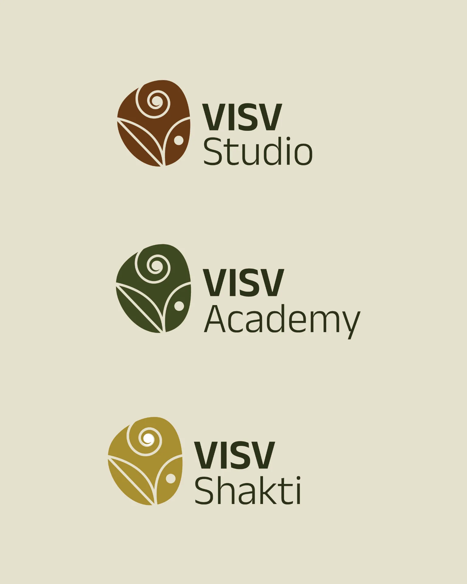
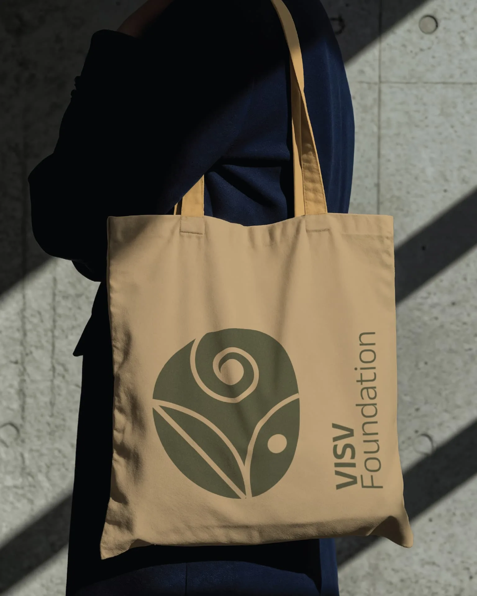
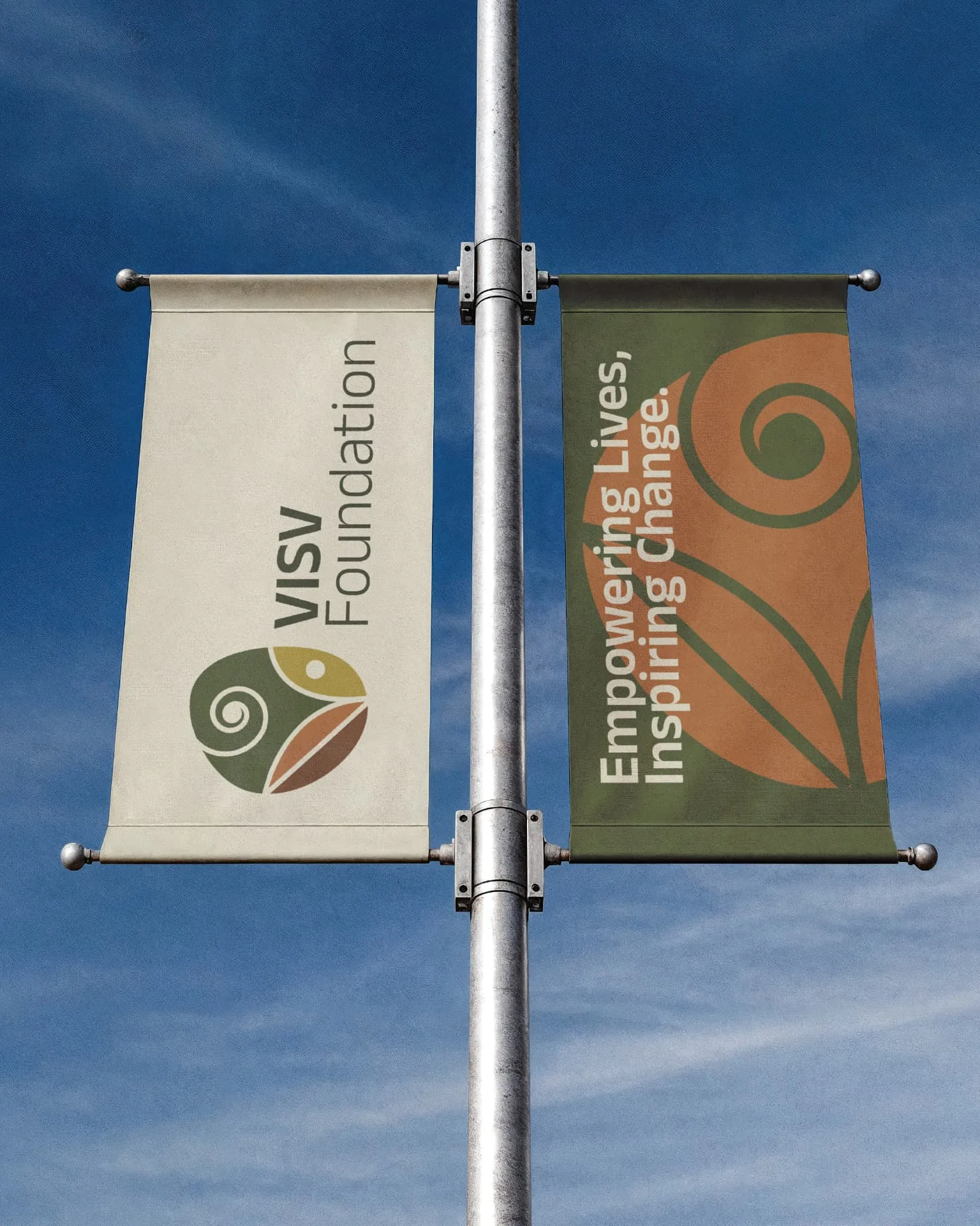
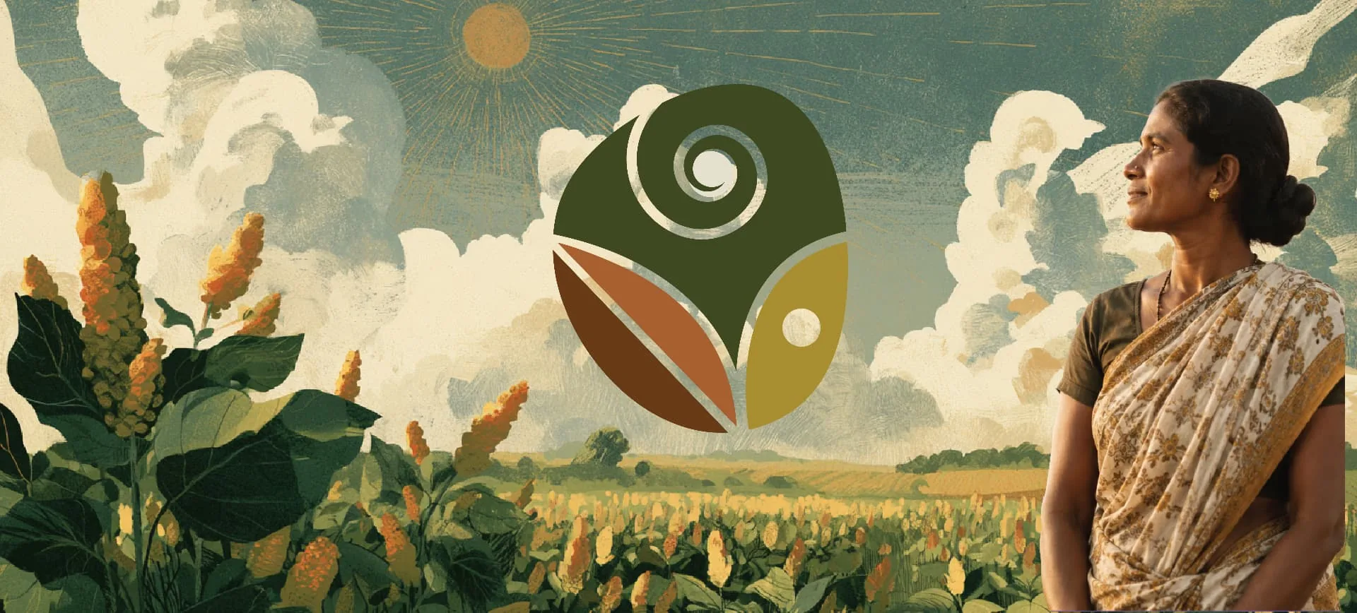
The mark is a seed form, and everything else sits inside it. A spiral stands for growth. A pair of leaf and grain shapes stands for nourishment. A single dot, an inner eye, stands for the potential. The elements are divided by thin lines of the background colour, so the mark reads as one enclosed shape rather than a cluster of parts. It holds in a single colour, reverses cleanly and stays legible at stamp size.
Colour is drawn from the dryland landscape where millet grows. Forest green leads, with olive, ochre, terracotta and a deep soil brown behind it, all set on a warm sand ground. The palette is deliberately sober. It had to feel at home on a village signboard and in a policy deck at the same time, and the restraint is what lets it do both.
The same seed carries VISV’s three engines. VISV Studio takes the brown, VISV Academy the green, VISV Shakti the ochre. One form in three colours keeps the architecture together as a single idea rather than three separate programmes.
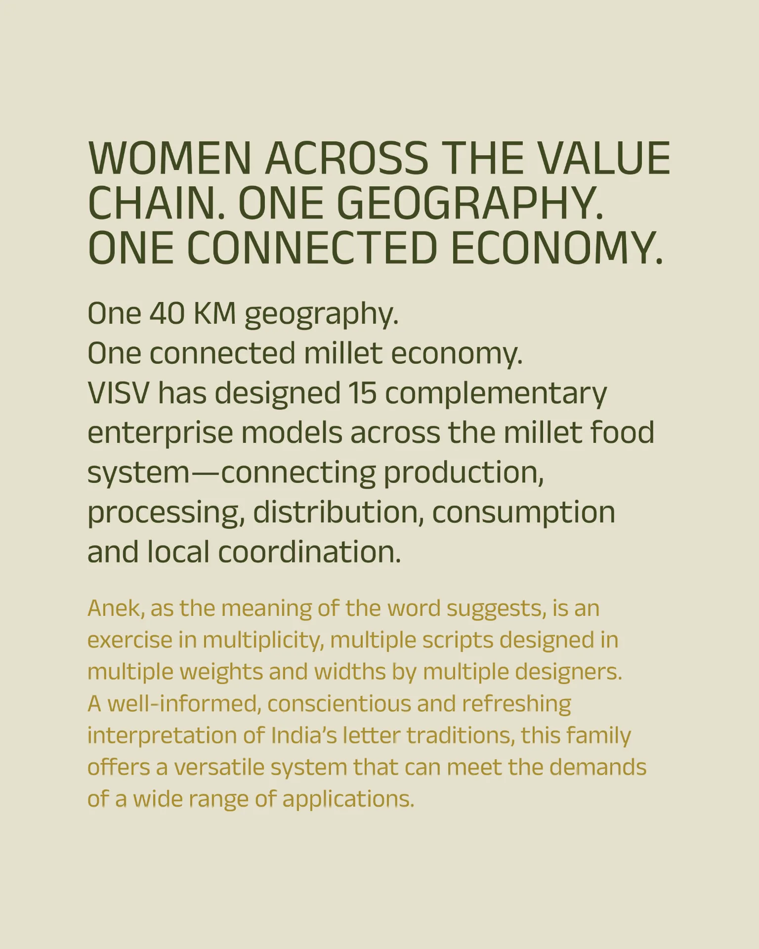
Type is Anek, Ek Type’s multi-script family drawn from India’s letter traditions. It is set heavy and condensed for the wordmark and for headlines, and light for everything else, so the acronym carries weight while the institution stays approachable. Because Anek covers Indian scripts as well as Latin, the system can speak in the languages of the women it serves without changing voice.
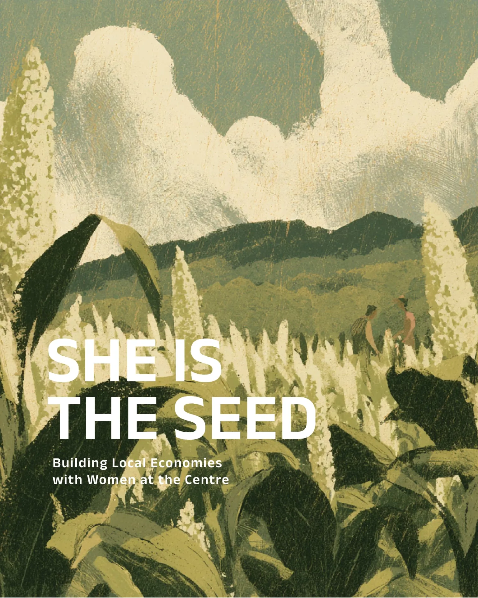
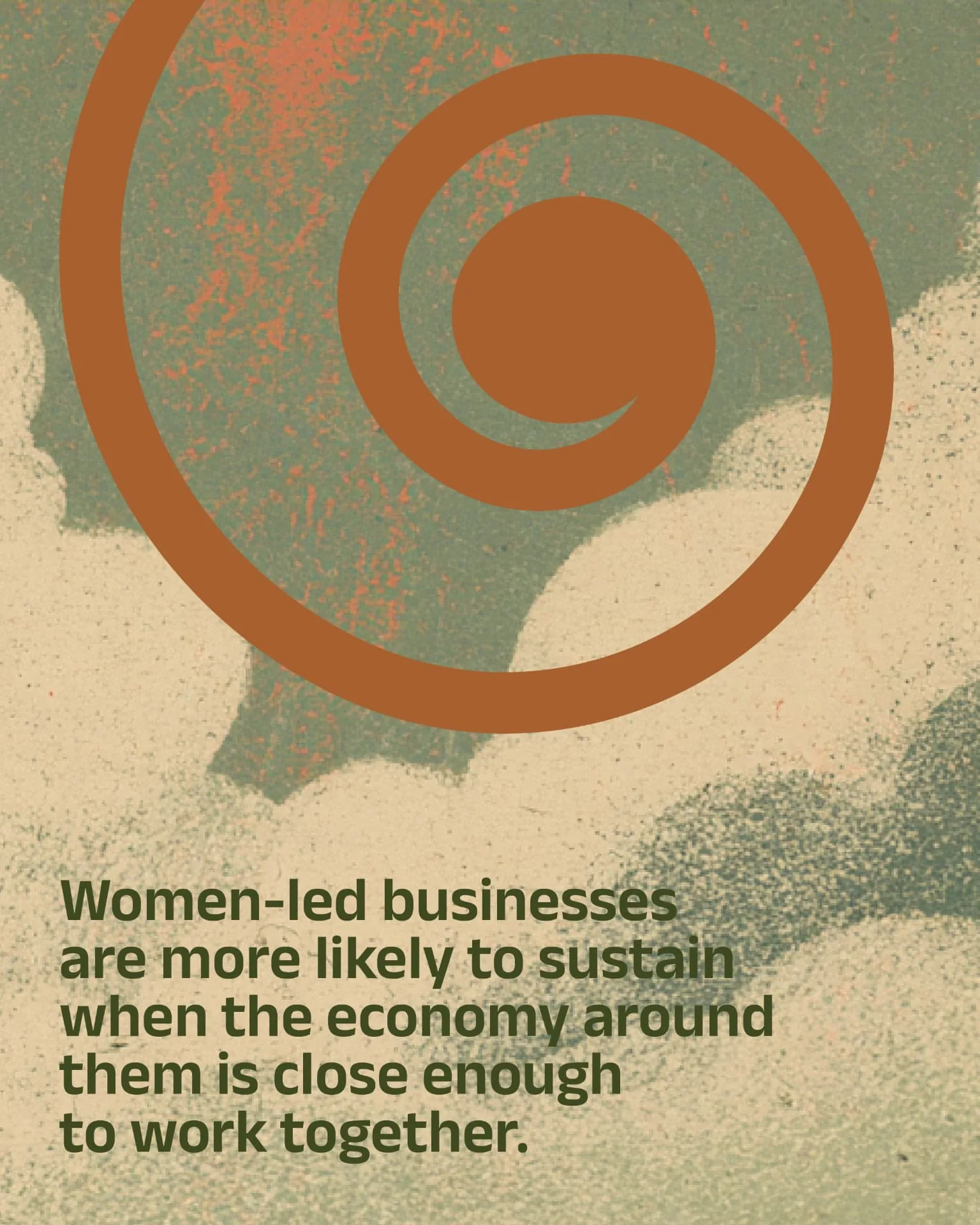
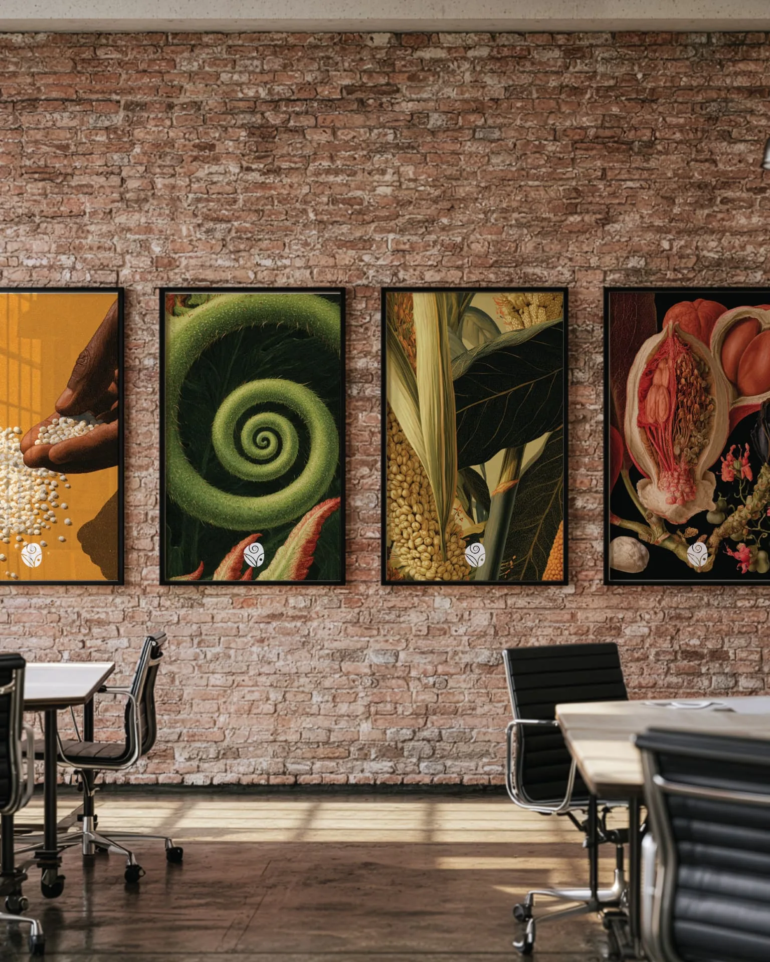
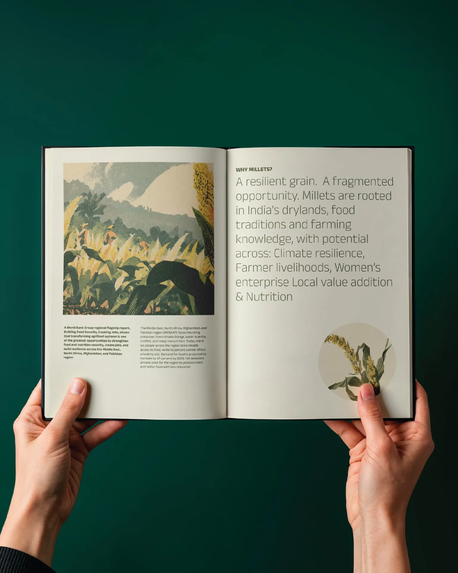
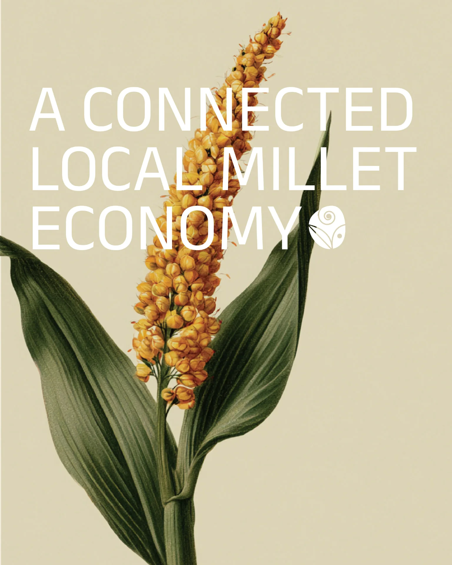
Around the mark is an illustrated world: millet fields, monsoon skies and botanical prints in a muted, textured register. These fill the seed form itself, turning the logo into a window onto the places VISV works, and they carry the brochure that introduces the foundation.