Praloop
Brand Identity & User Interface
Brand Identity & user interface for a project management platform built exclusively for event planners.
Brand identity and product design for a project management platform built exclusively for event planners.
Event planning is a business of moving parts and a date that does not move. Praloop, a Gurugram-based software company, set out to build the first project management tool made for this work, carrying an event from the first idea to the final invoice. Switch & Roy was asked to design the brand and the product interface together, so that the identity and the tool would feel like a single thing. The system that resulted is built on three ideas: fluidity, interconnectedness and adaptability.
Logo
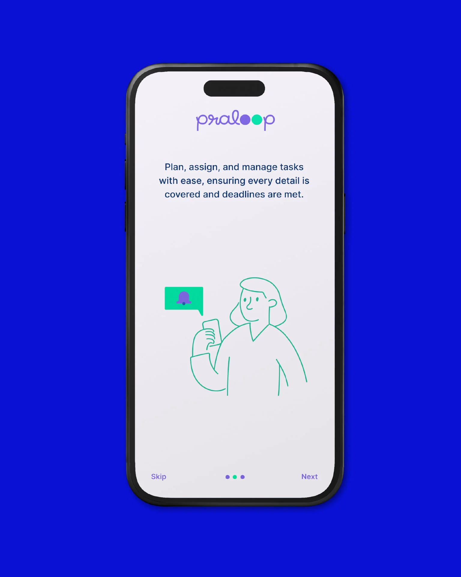
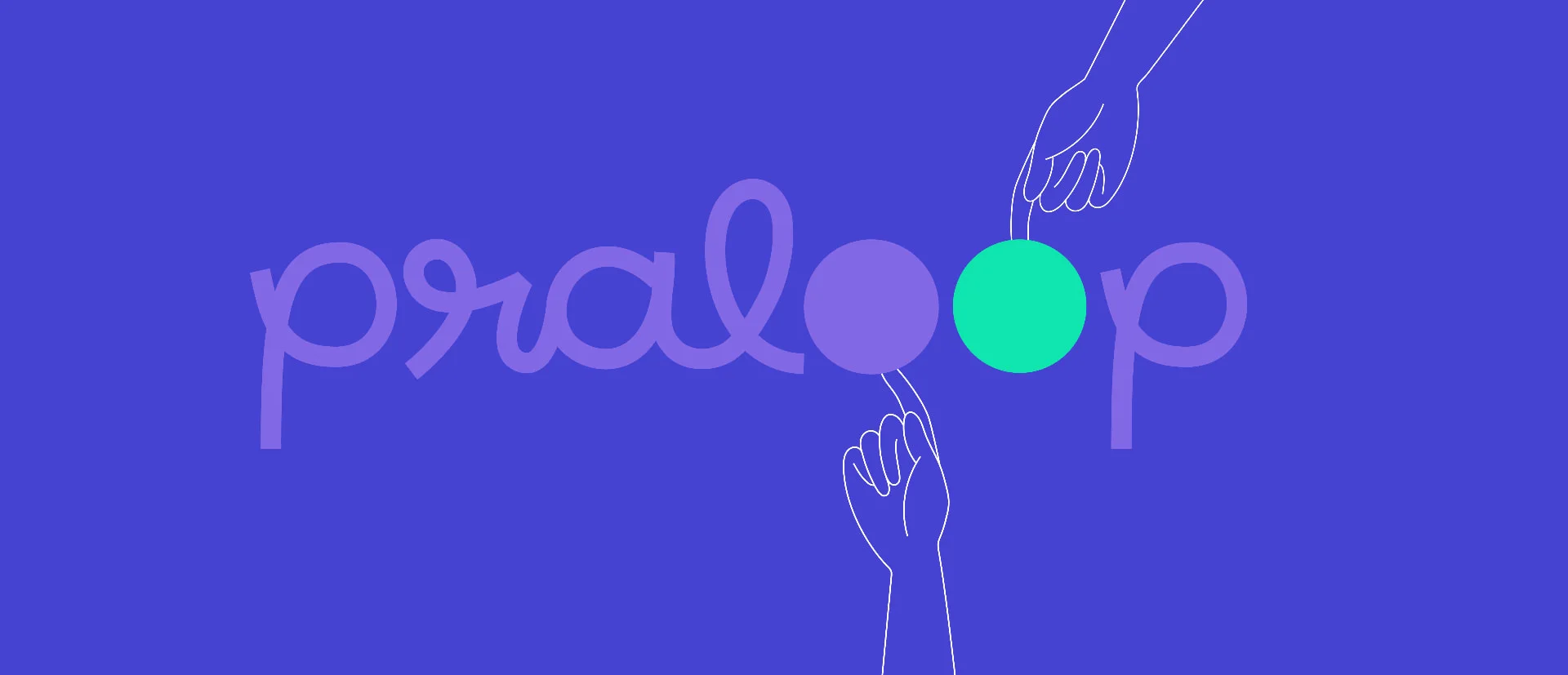
In the wordmark the two o’s of loop become solid circles, one violet and one green. They carry two meanings: the AI agent and the planner working together to keep event management seamless, and collaboration itself, which is the heart of the event industry. The logomark lifts the two circles out of the wordmark and works alone as a favicon and app icon, holding its weight across light, accent and dark backgrounds without adjustment.
Typography
Inter is the single typeface, in Medium, Semibold and Bold, chosen for the reason the product exists: to make complicated information legible. The hierarchy is deliberately shallow, three sizes on desktop and three on mobile, so a planner scanning a dashboard never has to work out which line matters most.
Colour
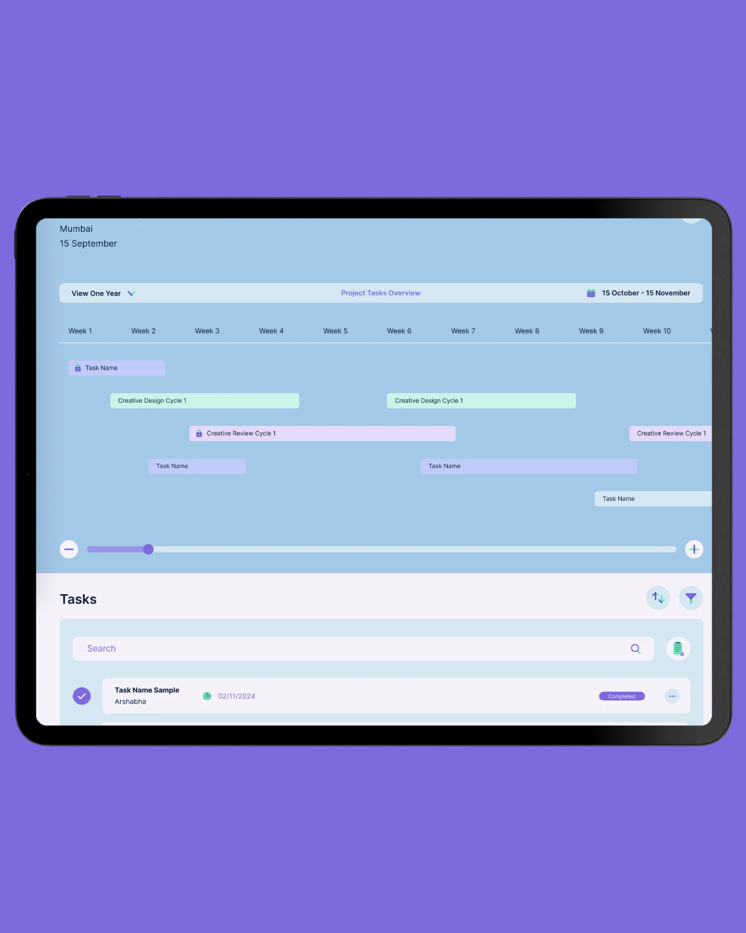
Two primaries anchor the palette: a violet (#8268E5) that carries the brand through navigation, buttons and headings, and a mint green (#10E4AF) that marks what is live, active or complete. Six accent colours separate projects and task types inside the application, each paired only with its own lighter tone, a rule that keeps a crowded planning view from turning into a rainbow as a project grows. The canvas is a pale lavender rather than white, easier on the eyes over a long day, and a dark mode shifts to deep blue and lets the primaries do the highlighting.
Iconography and illustration
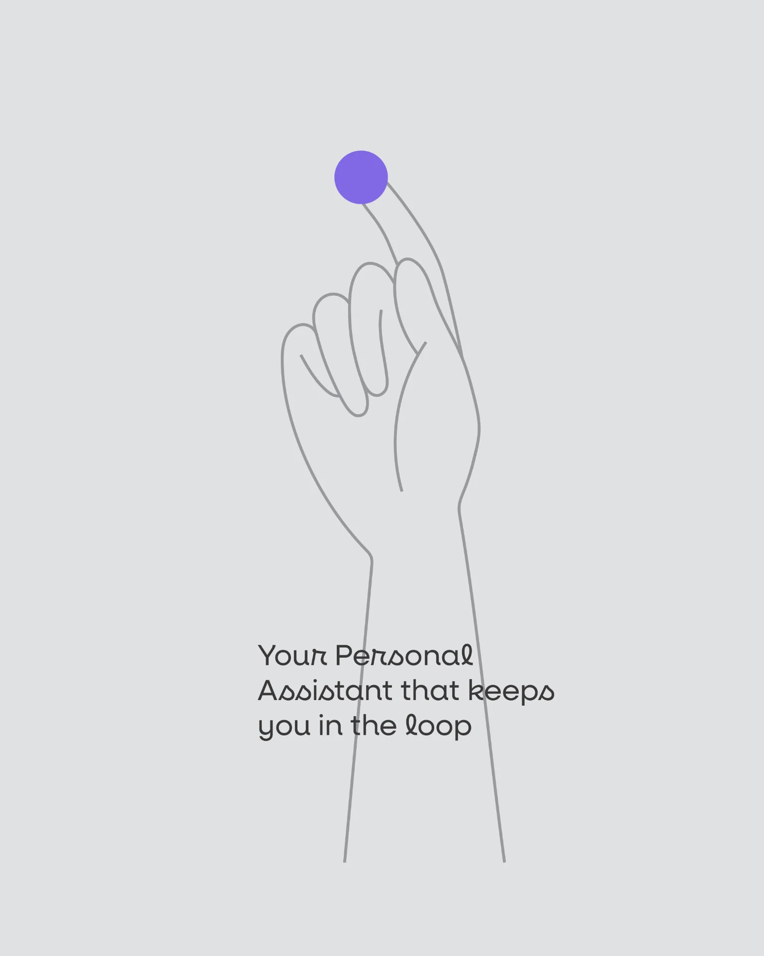
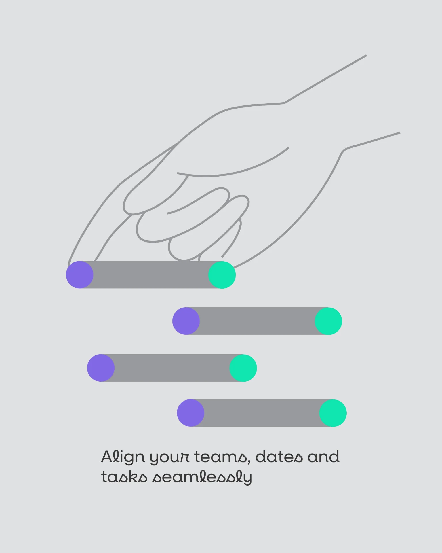
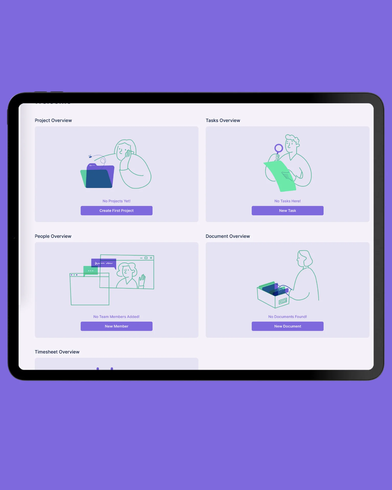
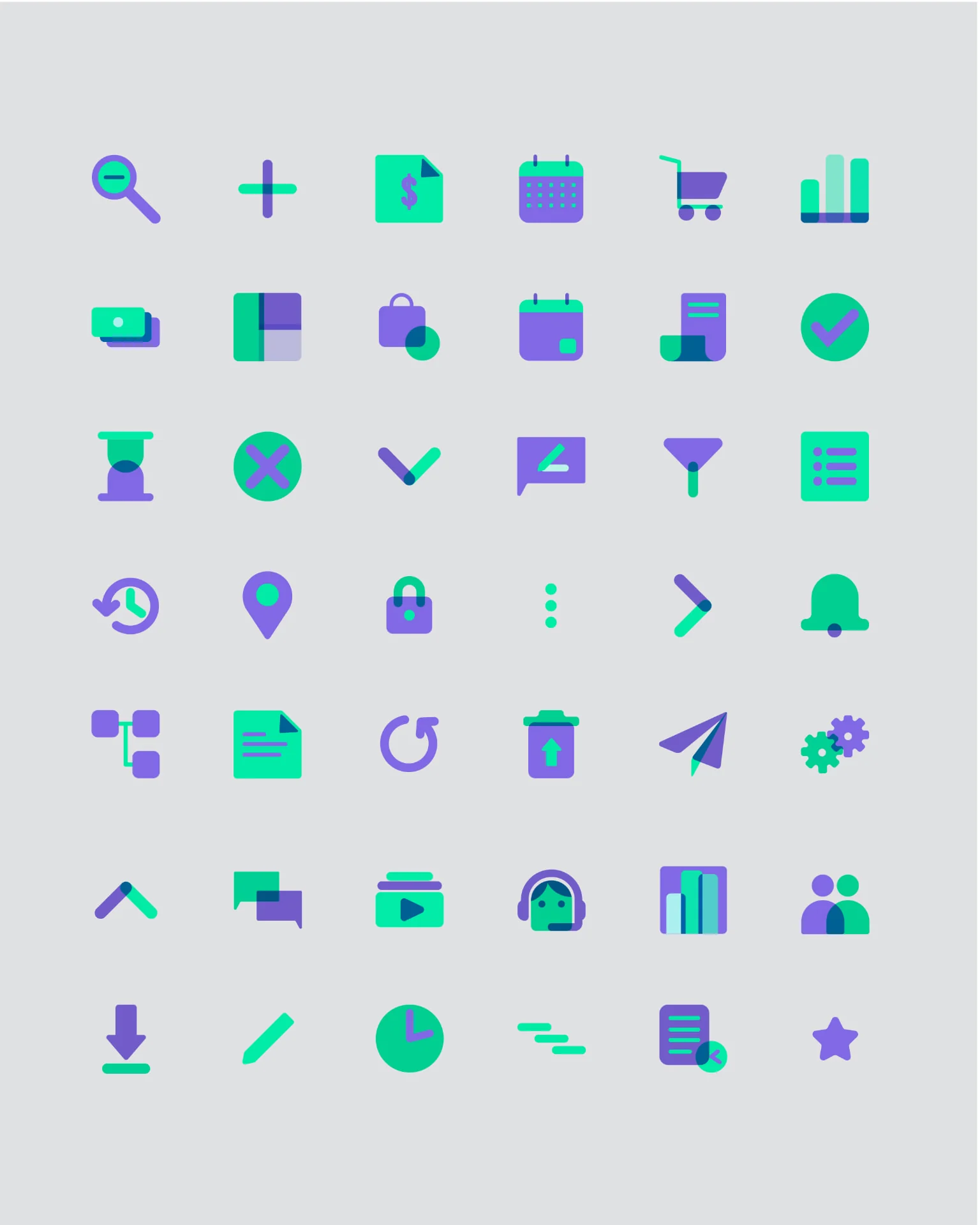
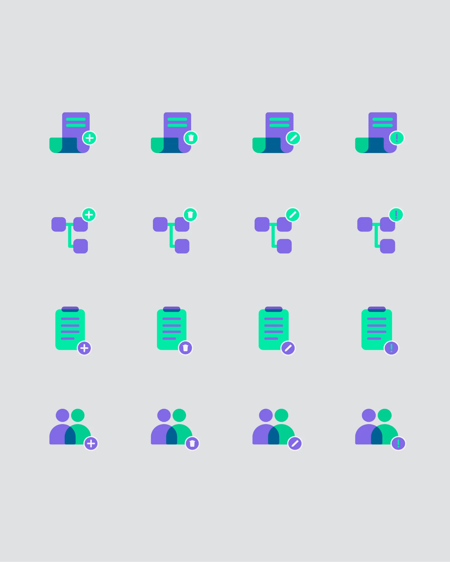
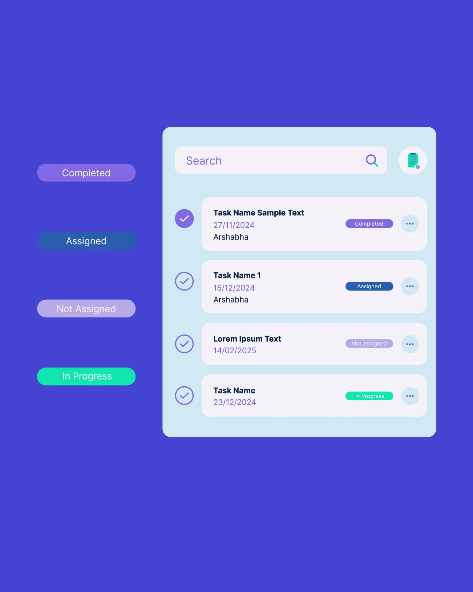
The icons are built from overlapping solids in the two primaries rather than single outlines, which gives them presence at a glance and ties them to the logomark. A compound set adds a plus, a tick or a clock to turn an object into an action, so a button can describe itself without a label on a phone screen. Four coloured status tabs sit on every task card and can be read across a list without reading the list. In the illustrations, objects follow the construction of the icons while the people handling them are drawn in a single loose line: the system is structured, the people using it are human.
Product design
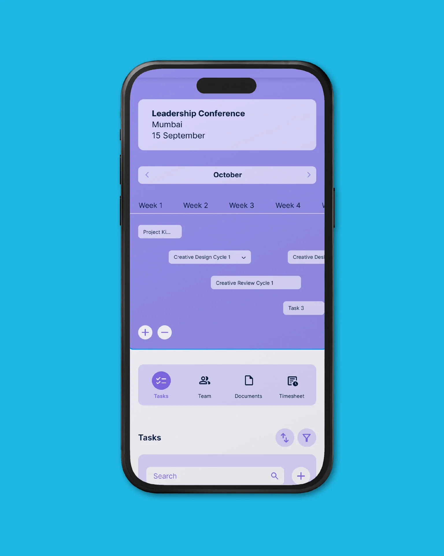
The desktop application opens on a dashboard of live projects, due tasks, team and recent documents, with the icon set as a persistent navigation rail. The planning view runs events as timelines across weeks, with tasks as accent-coloured bands that zoom from a single week to a whole year. The mobile version keeps the same colours, type and icons reflowed into one column, with nothing redesigned that did not have to be. A documented column grid sits under both so the engineering team can extend the interface without the design drifting.
Outcome
The identity and the product shipped as one system, documented in a set of brand guidelines covering logo, type, colour, icons, illustration, interface components and grids. Praloop is live at praloop.com, where the violet-and-green world built here now carries four product modules, a marketing site and a mobile experience.